Together with other objectives, the work of the Mobile team of the Wialon division is always focused on making the user experience better. It often implies working on the backend, which helps users work seamlessly with the system without any major issues.
The current update, though, involved the interface as well making it more user-friendly and smooth. Read on to learn the details.
Flexible navigation bar
What users can do themselves
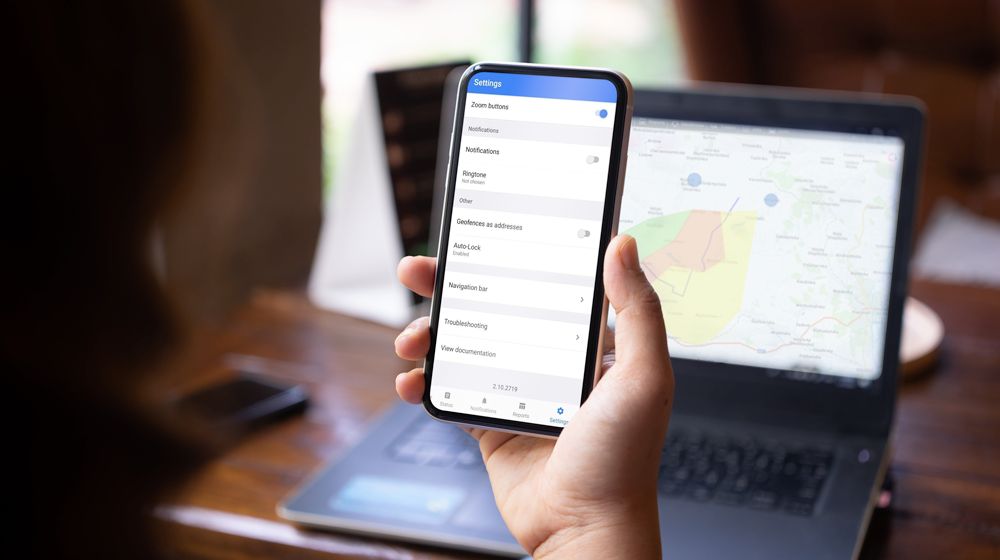
We improved the navigation bar at the bottom of the screen by adding the ability to leave only the necessary tabs there, i.e., hide unnecessary tabs. Clients can change the tabs order as well.
For example, your client has only one unit on the list. It’s pretty obvious that he doesn’t really need the Monitoring tab that shows the entire working list of units. So why let it take space in the tab bar? In the Settings tab, he can drag it to the block with hidden tabs, thus hiding it. Here he can also drag the Map tab to the top of the tab list so that he can see his unit on the map right after logging into the app.
Set up the navigation bar in the app’s Settings
As a result, the clients got a more flexible navigation bar that allows setting up the tabs order needed in the particular case. By the way, if there are many tabs on the bar, now they can be handily scrolled by swiping to the right or left or by clicking on the corresponding arrows.
The navigation bar with just three tabs left
What you can do for your clients
All the functionality described above is available for the app end-users. But as the solution provider, you can:
- change the tabs order;
- hide some or all the tabs except Settings. In this case, your client can enable those tabs via the navigation bar;
- deactivate any tabs except Settings by switching off or on the corresponding services in CMS. In this case, all features related to the tabs will be disabled too;
- add an additional tab with its own name (for example, Support) that will lead to an URL address of your choice (available for white label).
White label
The white label partners can now use more targeted positioning of the app, which will make selling it easier.
For example, you closely work with the companies in the security sphere catering for the safety of stationary assets. Most likely, the tabs they need are Geofences, Status, Notifications, and Reports. You can hide other tabs and sell the solution as the one tailored specifically to the security companies’ needs.
To change the tabs order and their visibility, you should submit a request to Gurtam specifying the needed configuration. Please note that this configuration can only be changed by building a new app version by Gurtam. In the future, we plan on an update that will let you do this yourself without submitting a request to Gurtam.
The customizable interface helps to better meet the needs of more narrow target groups, and a configurable navigation bar is our first step in this direction.
Test the new functionality and share what you think. We are looking forward to your feedback. If you have any questions or suggestions, feel free to leave them on the Gurtam forum.


.png)
.png)
.png)
