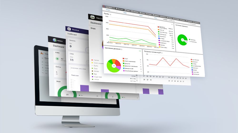
An important update in May is a new video module in Wialon Hosting that changes how video monitoring works, making it more simple both for partners and end-users. Other changes in Wialon and the apps cover reports and the interface: we have added the What’s new window in NimBus and upgraded dashboards, reports, and tables in Hecterra and Fleetrun.
Wialon Hosting
Video monitoring in Wialon
The release of the new video module has dramatically changed the work with MDVR devices and video files. Now it is easier for partners to connect end-users to the video monitoring service since they no longer need to deploy servers between devices and Wialon and integrate each model into the system. End-users have received new useful features: the ability to request a video, save video files and receive reports with an attached video.
New solution architecture
First, now it’s our responsibility to configure servers for video monitoring. The new video module no longer requires intermediate servers – the whole process of converting a video stream from an MDVR now takes place on the AWS servers that our team is responsible for.
Secondly, the specialists from the hardware department integrate video devices into the new video module themselves. Now it is much easier for the partner to connect video monitoring – all that they need to do is to install and activate the equipment.
Separate Video tab
All the video monitoring features are now collected in a separate Video tab.
It contains a video player and tools for working with video streaming and video files for units (the user can save, delete, filter them, and so on) on which an MDVR is installed. The user does not need to open different tabs and windows for each unit, everything is in one place now.
Live video and video playback
Now it is possible to connect to online video from a vehicle with an installed MDVR right from the Video tab.
Speaking about video playback (in Wialon it can be a video for 24 hours): the end-user connects to a recorded video in the same Video tab by choosing a unit, MDVR, and time interval.
Saving video files
The end-user saves video files:
- manually while watching a recorded video. To do this, it is enough to choose a file up to 60 seconds long, click the Save to files icon and choose a relevant tag making it easier to find the file in the future;
- automatically while setting up notifications. A new Save video as a file function has appeared in the notification parameters. The user specifies the total duration of the file and the duration of a time interval before and after the event. As soon as the event is triggered, Wialon automatically saves the video fragment on the server.
Video files in reports
In the new video module, video files are linked in reports to the events that triggered their saving. When the end-user sees in the report that an event has occurred with the vehicle (fuel theft, speeding, and so on), they will be able to immediately view the attached video file.
Want to offer video monitoring to your customers? Find out how to get started with the new video module in our blog.
Choosing a unit group in the Geofence table
When creating a report on geofences and a group of geofences, we added the ability to select not only a single unit but a unit group.
Now when the end-user creates a new unit, he no longer needs to manually edit the report template. All that he needs to do is to add a unit to the unit group, and Wialon will automatically generate a report on the whole group.
The list of new Wialon Hosting features is constantly growing. Register on the forum and be the first to know about the new functionalities.
NimBus
The What’s new window
Now you can learn about the new features of NimBus in a special What's new window. When one can’t follow the news on the blog, this is the most convenient and fastest way to get the latest information.
The window shows the last five updates. The end-user can find out the details of each of them by clicking on the Learn more button, and also go to the discussion of the new functionality on the forum.
Visit the forum and share your thoughts on the new features in NimBus.
Hecterra
Specifying a crop quickly
We have already written about a new method of specifying a crop quickly for one or more fields on the Fields page, without using the properties of the field or the Crop rotation tab. The method works with fields only if there are no crops in them yet (to find them, use the No crop option in the Filter by crop).
In May, we added the possibility to:
- edit the sowing date. Previously, the default date was January 1 of the current year, and it was impossible to change it, while now the user can indicate any date themselves;
- indicate the harvesting date. The end-user can do it on the Field page, without using the properties of the field.
For example, if a client planted several fields with one crop, they will be able to enter information about this, as well as indicate the sowing date and the estimated harvesting date, with a single action in Hecterra and do it much faster than before.
To do this, the end-user should:
- on the Fields page, click on the leaf icon in the row in the list or in the field menu on the map;
- after selecting the crop, indicate the sowing (required) and harvesting (optional) dates and save the options.
If the user works with several fields, he needs to select the fields and then click on the leaf icon to indicate the crop, the sowing and harvesting dates.
Updating the top menu
The Catalogues item of the navigation bar contains subitems for opening the following pages: Crops, Operations, Implements, and Consumables.
The top bar now has fewer tabs, and it’s easier to find the needed catalogue.
Find more on the new features, as well as comments on the app processing and user experience on the Wialon forum.
Fleetrun
Making the dashboard customizable
The Dashboard page displays information on a fleet in blocks: Services, Intervals, Cost, Units, and so on. It often happens that the user does not need all of them in their work.
Now they can disable unwanted blocks. The user just needs to click on the button – three vertical dots to the right of the calendar – and remove the unused blocks from the opening window.
Some of the blocks, for example, Services and Units, can be resized manually by pulling the lower right corner of the section. Blocks can also be moved in any order to assemble a page that is optimal for the end-user.
The user can also disable the indicators they don’t need in the blocks:
- Cost: by clicking on the icon in the upper right corner, he can deactivate the Services and fuel checkbox selected by default and leave only Services or only Fuel;
- Total cost of services: by clicking on the icon Units, Drivers, or Trailers, the user turns off the indicators for this parameter. As a result, the total cost is recalculated in the Total column, and the graph displays the data minus the deactivated parameter.
Graph updating
Total cost of services
To keep the fleet expenses data for a certain time period visible, we changed the “Total cost of services” graph on the dashboard and on the unit page by adding:
a Total field with the total amount of the fleet services expenses for the selected period;
a field with the total amount of expenses per 1km for the selected period;
a field with the total amount of expenses per engine hour for the selected period.
The period is set in the calendar on the Dashboard and on the unit page.
Fleet metrics/Unit metrics
For more convenience, we have made minor changes to the Fleet metrics graph on the dashboard and to the similar Unit metrics graph on the unit page. Now the user can check the vehicle mileage in kilometers or engine hours for the selected period, and the information will be displayed in the Total field.
A new Total cost of fuel graph
To allow the end-user to see the fuel costs for the entire fleet and an individual unit, a new “Total cost of fuel” graph was added on the Dashboard and on the unit page. It helps to see the difference in expenses in different time periods.
Find more details on Fleetrun new features in Wialon Help Center. Your requests and suggestions are discussed in the forum topic.
Logistics
Moving orders on the map
Moving order cards became much quicker and easier: the end-user can move them from one route to another on the map.
The Move button was added to the order cards in the upper right corner. The end-user clicks on the button and selects the route on the map to which the order will be transferred. The new order automatically changes the route, while the app assigns a position number to it.
The improved “Take into account the location of units” option
Now, if the “Take into account the location of units'' option is enabled when creating a route, the route from the unit to the first point is displayed on the map. In addition, the estimated arrival time and the distance from the unit to the first point are calculated and displayed in the table.
The Route cost column
The column Route cost has been added to reports on routes and to reports on routes and orders. This greatly simplifies expenses planning: the column shows the route cost values that are calculated during the optimization if the corresponding parameters are indicated in the settings in the Route cost calculation section.
New design of the notification window
We improved the design of the Notifications window – now it is easier to grasp the information in it and work with the window:
- the window has become larger;
- updated the style of the pop-up notifications about errors and completed actions;
- improved display of unread messages;
- all notifications can be marked as read;
- the Show button is added for simpler navigation.
Visit the forum to read more about the new Logistics options. Please share your experience with the updated functionality.
Try and test the new features of the platform and apps and leave your comments on the Wialon forum.



.png)
.png)
.png)
